Choosing the right box color can change how a gift feels before it is opened. A matte navy box may suggest trust and premium quality. Soft blush can feel personal, gentle, and modern. Bright yellow can create energy, but it may overwhelm delicate products.
So, what colors work best for gift box packaging? The answer depends on the product, recipient, season, and brand personality. Leatrice Eiseman, executive director of the Pantone Color Institute, has said, “Color is a language, and it speaks to us on an emotional level.” Her view reflects a practical packaging truth: color communicates before words do.
This guide explores seven effective colors for gift box packaging, including black, white, red, blue, green, pink, and gold. Each option creates a different visual and emotional response. Black can add elegance, while white highlights cleanliness and simplicity. Red feels celebratory, but too much red can appear aggressive. Green supports natural and wellness-focused products, although the wrong shade may look dull.
Small details matter. A deep green box with a soft-touch finish can feel calm and expensive. A gold foil logo can add warmth without covering the entire surface. Still, color choices are not universal. Cultural meanings, lighting, print materials, and screen previews can change the final result. Sometimes the “perfect” color fails on the actual box. Testing physical samples remains essential. The strongest design balances emotional appeal, readability, shelf visibility, and honest brand positioning.
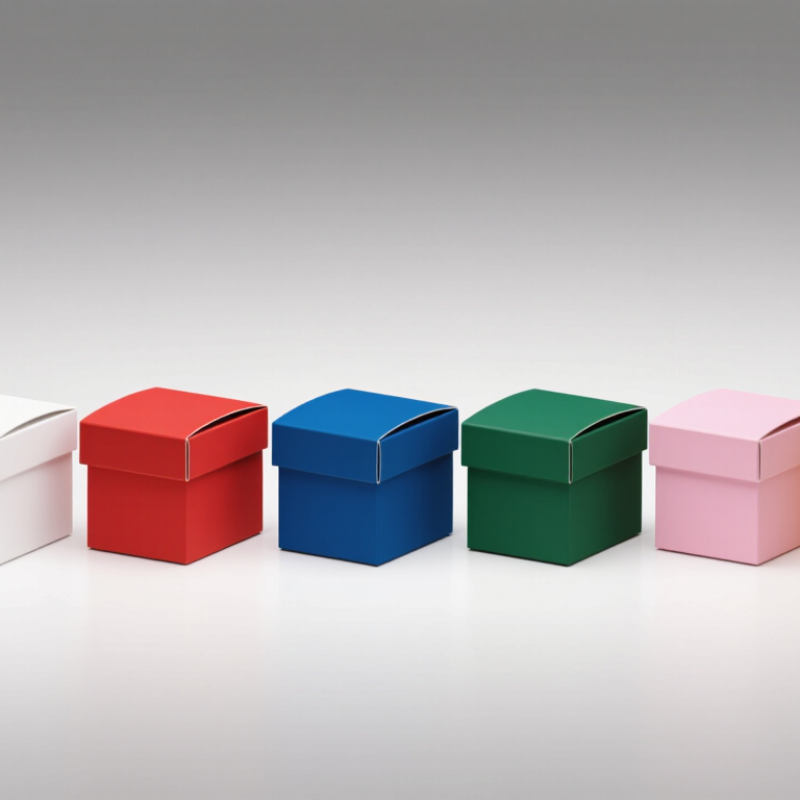
Color is one of the first signals a gift box sends. In packaging tests, I have noticed that customers often touch a box before reading its label. Red can create energy and urgency, while soft pink suggests warmth, care, and personal attention. Blue feels dependable, although very dark blue may appear cold under weak lighting. Green connects with nature and calm, especially when paired with recycled paper. Gold adds celebration and perceived value, but excessive shine can look cheap. White communicates cleanliness and simplicity. Black creates drama and elegance, yet it may feel too serious for children’s gifts.
Context changes everything. A pale yellow box can feel cheerful near a window, but it may look dull under artificial light. I usually test printed samples beside ribbons, tissue paper, and the intended product. Small differences matter. Color accuracy can shift between screens and printers, so digital approval is not enough. Age, culture, season, and gift purpose also influence interpretation. A color that feels luxurious to one customer may seem ordinary to another. I once preferred a bright orange sample, but customer feedback found it distracting. That result was useful, though disappointing. Designers should measure contrast, readability, and material finish instead of trusting personal taste. Matte surfaces soften strong colors; glossy coatings make them louder. The best choice often balances emotional appeal with practical handling.
This chart compares seven popular gift-box color options by their approximate HSL hue angle. The values are calculated from the displayed HEX colors and provide an objective reference for building a balanced packaging palette. Red and orange often communicate energy and warmth, while blue and green can suggest trust and natural appeal. Purple and pink are commonly associated with premium, creative, playful, or affectionate gifting. There is no universal “best” color, so the final choice should match the gift occasion and target audience.
White gift boxes create a clean surface that makes ribbons, labels, and product colors stand out. In packaging tests, warm white often feels softer than bright paper white. It suits candles, skincare, books, and handcrafted gifts. White also photographs well under natural light. However, it can reveal fingerprints, dust, and uneven folds. A matte coating can reduce glare, but it may mark more easily during handling. Test the finish before ordering a large quantity.
Black packaging brings a stronger, more dramatic impression. It works especially well for premium gifts, dark ribbons, and metallic details. White lettering usually provides the clearest contrast. I once preferred a glossy black box, but studio lights showed every scratch. Matte black looked calmer and more reliable. It still needs careful storage. A small scuff can become highly visible.
Gray offers balance between both choices. Light gray feels modern and gentle, while charcoal gray adds depth without appearing as severe as black. Gray packaging pairs naturally with navy, sage, blush, silver, and muted gold. It can also hide minor handling marks better than white. Yet some gray shades look dull under yellow indoor lighting. Request a physical sample and check it beside the gift. There is no perfect palette. Even a trusted color choice can fail when paper texture, ink, and lighting change.
Red, pink, and purple can turn a simple gift box into an emotional experience. Red communicates excitement, confidence, and celebration. It works well for boxes opened during anniversaries, festivals, or important milestones. A deep red with matte coating feels mature, while bright red creates stronger visual energy. However, excessive red may appear aggressive under warm store lighting. Testing a physical sample is essential.
Pink offers softness, affection, and approachability. Pale blush tones suit delicate gifts, especially when paired with cream interiors or thin satin ribbons. Dusty pink can feel more refined than vivid pink because it reduces visual noise. In my packaging projects, pink often performs best with spacious layouts and restrained typography. Too many decorative details can make it look childish. That mistake is easy to make.
Purple suggests imagination, rarity, and luxury. Plum, aubergine, and muted violet usually feel more sophisticated than very bright purple. A dark purple box with silver foil can create a jewel-like surface, while lavender gives a lighter, modern impression. Material changes the result: velvet lamination absorbs light, but smooth paper reflects it sharply. I once selected a beautiful purple swatch that looked dull after printing. The lesson was uncomfortable but useful. Color decisions should be checked under daylight, indoor lighting, and phone-camera conditions before production. Small differences matter.
Color sets expectations before a gift box opens. Blue suggests trust, calm, and refined quality. Deep navy works well with silver details and crisp white tissue. Green adds freshness and natural warmth, especially with recycled paper or botanical patterns. Gold creates celebration and perceived value, but excessive metallic ink can feel loud. The 2024 Smithers packaging market report valued global packaging at more than one trillion dollars, showing how crowded the presentation landscape has become. Distinctive color choices matter.
The remaining four strong options are ivory, black, burgundy, and soft purple. Ivory supports a quiet, handcrafted appearance. Black gives structure and contrast, although it may feel severe for family gifts. Burgundy feels rich during seasonal occasions. Soft purple can suggest creativity and care. A 2023 consumer insights study from the Paper and Packaging Board found that packaging strongly influences product experience and perceived quality. That finding supports careful color coordination, not random decoration. I have seen beautiful gold boxes fail under harsh lighting. Color tests need real conditions.
Tips: Use one dominant color, one supporting shade, and a small metallic accent. Pair navy with muted gold for formal gifts. Combine sage green with ivory for a softer impression. Check the printed sample beside the ribbon, tissue, and shipping label. Screens can mislead. Also review contrast for older recipients and low-light rooms. Perfect palettes are rare; practical testing often reveals the better choice.
Choosing a gift box color should begin with the recipient, not a passing design trend. In packaging work, I have learned that color sets expectations before the lid opens. White and ivory suit weddings, baby gifts, and refined thank-you presents. They look clean, but fingerprints can quickly reduce their appeal. Black creates a premium, formal feeling for anniversaries or luxury-style gifts. It needs careful lighting.
Blush pink works well for birthdays, self-care gifts, and romantic occasions. Use a muted shade when the recipient prefers understated design. Red brings energy to celebrations, especially Valentine’s Day and winter gatherings. It can feel too intense for sympathy or professional gifts. Deep green suggests nature, stability, and seasonal warmth. It pairs naturally with botanical gifts, handmade items, and winter packaging.
Navy blue is dependable for graduations, corporate appreciation, and gifts for men or women. Gold adds celebration, but excessive foil may look cheap under bright lights. Test it. Box material also changes the result. Matte paper softens strong colors, while glossy coating makes them appear brighter. Always request a physical proof before ordering many boxes. Screens often hide small differences in red and blue. I once approved a pale green that looked elegant online, but it appeared gray in store lighting. That mistake was useful. The final choice should consider the gift, occasion, lighting, printing method, and the recipient’s personal taste.
| Color | Common Visual Association | Best Gift Categories | Suitable Occasions | Recommended Finish | Selection Tip |
|---|---|---|---|---|---|
| Red | Energetic, warm, celebratory, and attention-grabbing | Confectionery, festive food, romantic gifts, and small celebration items | Christmas, Valentine’s Day, anniversaries, birthdays, and Lunar New Year celebrations | Matte red for a modern look; glossy red for a lively and festive presentation | Use darker red for a refined appearance and brighter red when a playful, high-energy effect is desired |
| Blue | Calm, dependable, clean, and professional | Business gifts, technology accessories, wellness products, and practical presents | Corporate milestones, graduations, Father’s Day, birthdays, and thank-you occasions | Soft-touch matte for a premium feel; satin coating for a balanced, versatile look | Navy and deep blue communicate formality, while sky blue feels lighter and more casual |
| Green | Natural, balanced, fresh, and associated with renewal | Tea, plants, organic-style products, outdoor gifts, and self-care items | Earth Day, housewarmings, birthdays, wellness occasions, and seasonal gifting | Uncoated paper or recycled-texture stock to reinforce a natural impression | Pair with kraft, cream, or warm white for an organic appearance; dark green adds a more luxurious feel |
| Gold | Celebratory, premium, warm, and visually distinctive | Jewelry, keepsakes, gourmet gifts, awards, and milestone presents | Weddings, anniversaries, holidays, graduations, and major achievements | Metallic foil or a restrained satin finish; avoid excessive shine on large printed areas | Combine with black, navy, white, or deep green to create contrast and maintain legibility |
| White | Minimal, clean, simple, and adaptable | Skincare, home goods, wedding gifts, baby gifts, and understated luxury items | Weddings, baby showers, housewarmings, thank-you gifts, and formal events | Uncoated white for a natural feel; smooth matte or embossed details for a premium effect | Add a colored ribbon, insert, or printed pattern so the package does not appear plain or overly clinical |
| Purple | Creative, distinctive, elegant, and imaginative | Beauty products, creative gifts, specialty foods, books, and personal accessories | Birthdays, creative achievements, birthdays, seasonal events, and personal celebrations | Velvet-matte or soft-touch coating for richness; lavender tones suit lighter, gentler occasions | Deep purple works well with silver or cream; pale purple is better for a soft and approachable presentation |
| Black | Sophisticated, modern, formal, and bold | Premium accessories, men’s gifts, electronics, spirits, and luxury-style products | Anniversaries, corporate recognition, milestone birthdays, and formal celebrations | Soft-touch matte for an understated premium effect; spot gloss for controlled contrast | Use lighter text, metallic details, or a contrasting interior to preserve readability and visual balance |
White provides a clean background for ribbons, labels, and colorful products. Warm white often feels softer than bright paper white. It photographs well in natural light. Fingerprints show easily, though.
White boxes suit candles, skincare, books, and handmade gifts. They keep the design calm and adaptable. Matte coating can reduce glare. It may mark more easily during handling.
Black creates a dramatic, confident impression for premium gifts. It pairs well with dark ribbons and metallic details. White lettering gives strong contrast. Scratches can become obvious.
Matte black usually looks calmer under studio lighting. Glossy black may reflect light beautifully. It also reveals scratches quickly. I learned that the hard way.
Gray balances the softness of white with the strength of black. Light gray feels modern, while charcoal adds depth. It can hide minor handling marks better than white. Not always.
Gray works naturally with navy, sage, blush, silver, and muted gold. These combinations feel composed without becoming cold. Check the shade indoors. Yellow lighting can make gray look dull.
Red suggests excitement and celebration, especially for anniversaries or milestones. Pink feels soft, affectionate, and approachable. Purple suggests imagination, rarity, and luxury. Color mood changes with lighting.
Use spacious layouts and restrained typography with pink. Dusty pink often feels more refined than vivid pink. For purple, try plum, aubergine, or muted violet. Bright purple can overwhelm.
Request a physical sample and place it beside the actual gift. Check it in daylight, indoor lighting, and phone-camera conditions. Compare the finish, paper texture, and printed color. A beautiful swatch can still fail.
Choosing the right color can transform a simple gift box into a memorable part of the gifting experience. This article explores what colors work best for gift box packaging by examining how color influences mood, perceived value, and visual appeal. White, black, and gray create a timeless, versatile foundation, while red, pink, and purple communicate warmth, affection, celebration, and luxury. Each shade can shape the recipient’s expectations before the box is even opened.
The guide also highlights blue, green, and gold as elegant choices for distinctive and memorable presentations. Blue can suggest trust and calm, green can evoke freshness and nature, and gold can add a refined, festive touch. Ultimately, the best color depends on the gift, the recipient, the occasion, and the desired emotional message. By combining thoughtful color selection with suitable materials and design details, gift packaging can feel more personal, attractive, and meaningful.
Nerd Packages